

The Insight:
Much of the issue was in the site’s design and user accessibility. The pieces were in place, but a range of updates would be required to improve usability for both front- and back-end users, maintain a community feel, highlight products, services, and internal teams, enhance mobile friendliness, and prepare for future changes.


The Solution:
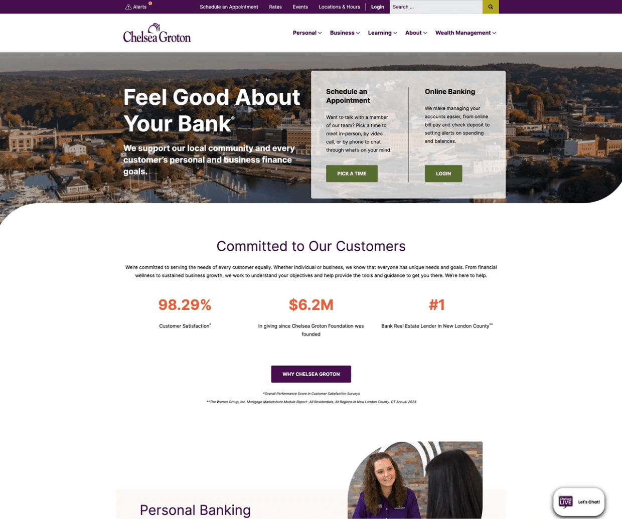
First, we developed an entirely new site map and navigation to showcase and amplify the bank’s wide range of personal banking and business products and services and, especially on the business side, the core banking teams. We then deployed a WordPress CMS to provide the flexibility and control users needed to edit the website, including integrations such as a mortgage calculator for prospective users and tie-ins with Chelsea Groton’s prospective CRM. The site was also built to meet the latest WCAG accessibility standards.


The Results:
Chelsea Groton Bank’s more modern, well-equipped website features community-first messaging and effectively takes users on a journey that quickly and seamlessly connects them to the services and products they need, their bankers, and more closely to the bank.

