Rodeo Cannabis rode into the Connecticut market with momentum and a sense that something bigger was waiting to be defined.
As they prepared for a business transformation with plans for a multi-state expansion, what it needed most was a point of view (the only direction we had: Make the brand cowboy, but not too cowboy). A spirit. Something that could turn attitude into identity and carry the new brand forward with confidence.
Instead of leaning into traditional Western tropes, we looked west in a different way; toward the nostalgia of the American road trip. The in-between moments. The detours. The feeling of heading somewhere simply because you didn’t know what you’d find.
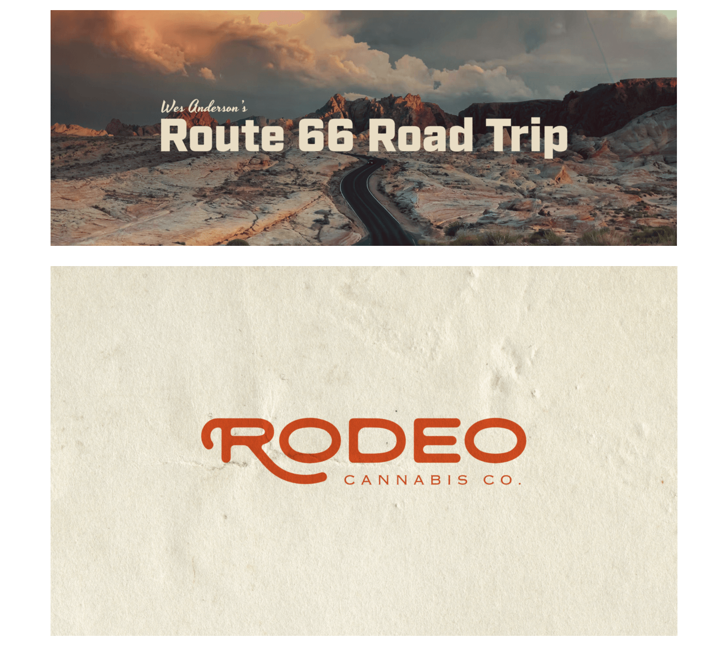
With that spirit in place, we explored three distinct—but connected—creative directions: SoCal Cowboys, Nevada Truckstop Party, and Wes Anderson’s Route 66 Road Trip.

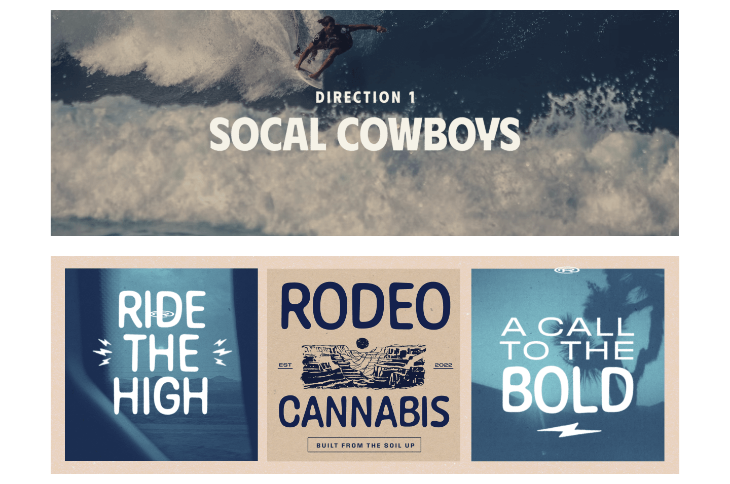
SoCal Cowboys is a relaxed, sun-faded take on the West, influenced by surf and skate culture rather than frontier mythology. Washed blues, sandy neutrals, and warm, nostalgic tones pair with playful, graphic typography to create a design-forward aesthetic that feels effortless and modern. Subtle Western cues—postcards instead of spurs, palm trees instead of cacti—give the brand a laid-back confidence rooted in style, creativity, and ease.
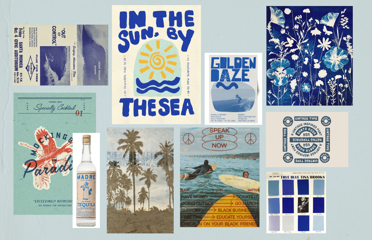
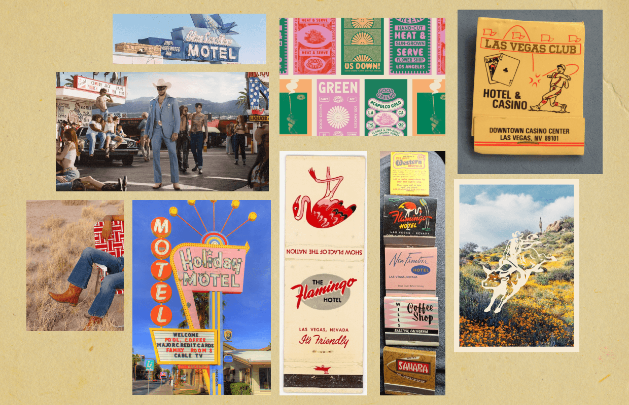
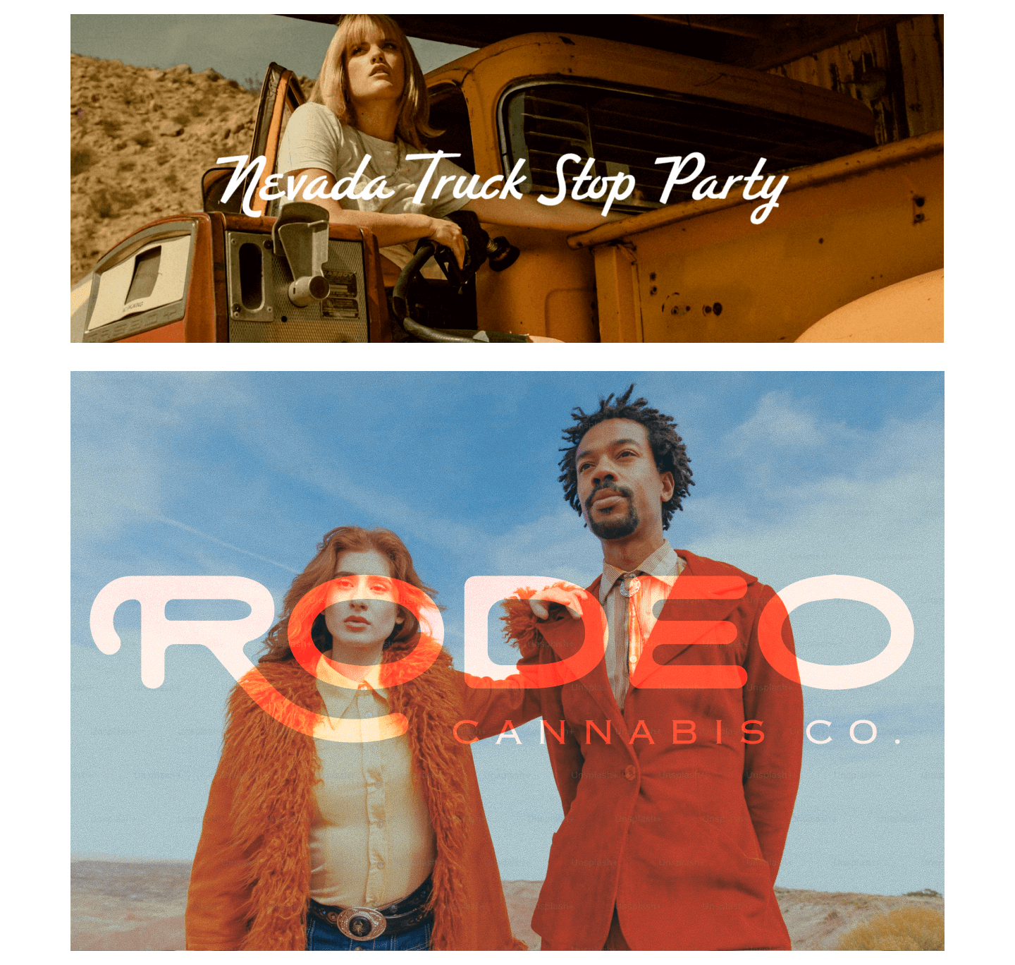
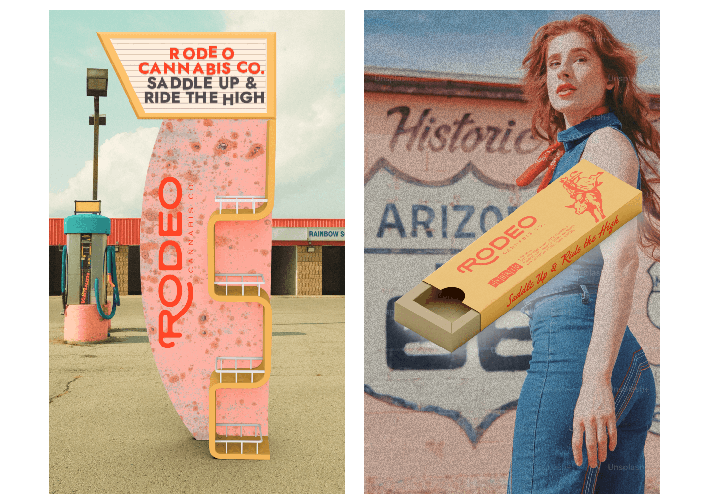
Nevada Truckstop Motel Party is bold, high-energy, and unapologetically loud. Inspired by neon motel signs, desert highways, and late-night roadside chaos, it uses saturated color, expressive typography, and collage-style visuals to capture the grit and humor of roadside Americana. This direction leans into spontaneity and excess, positioning the brand as playful, rebellious, and impossible to miss.
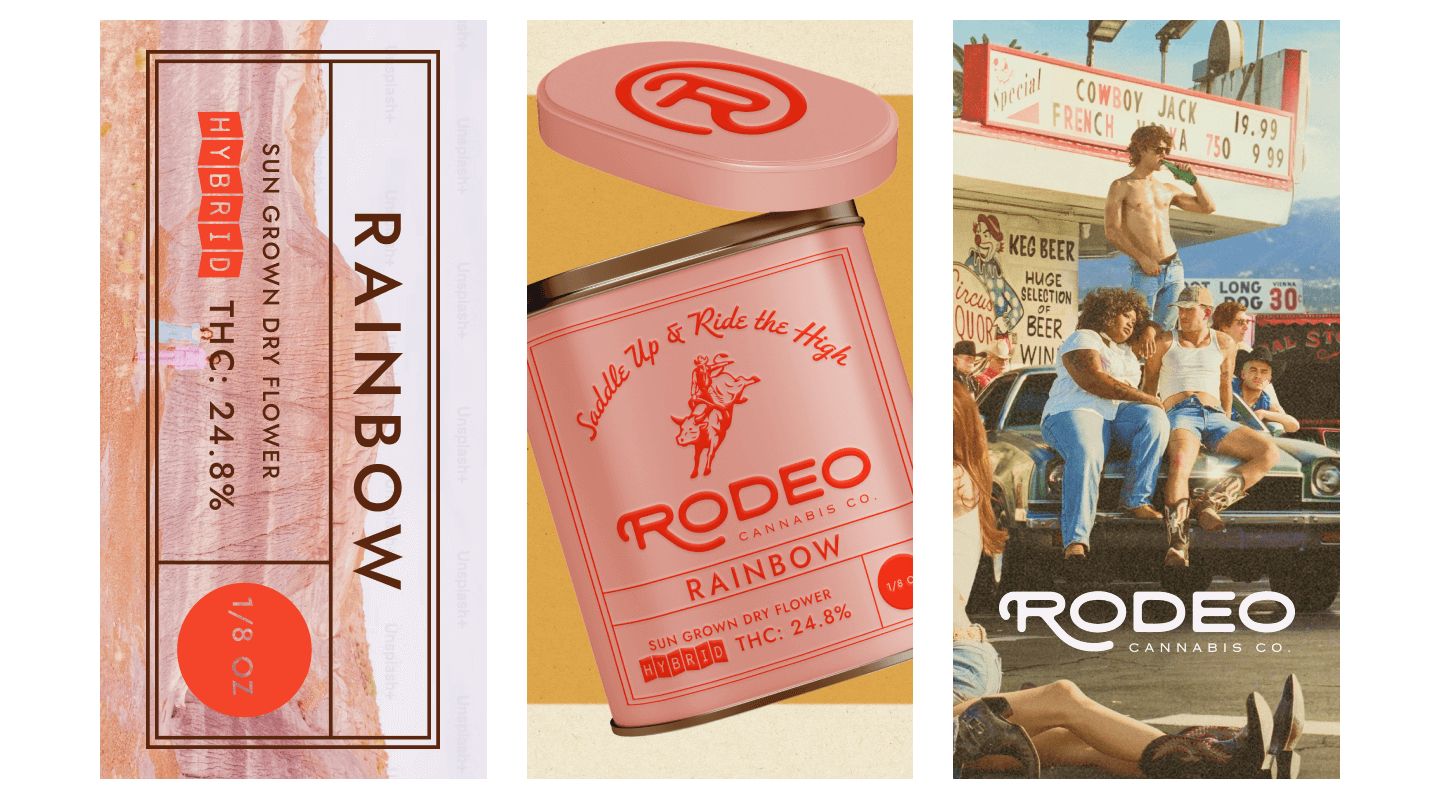
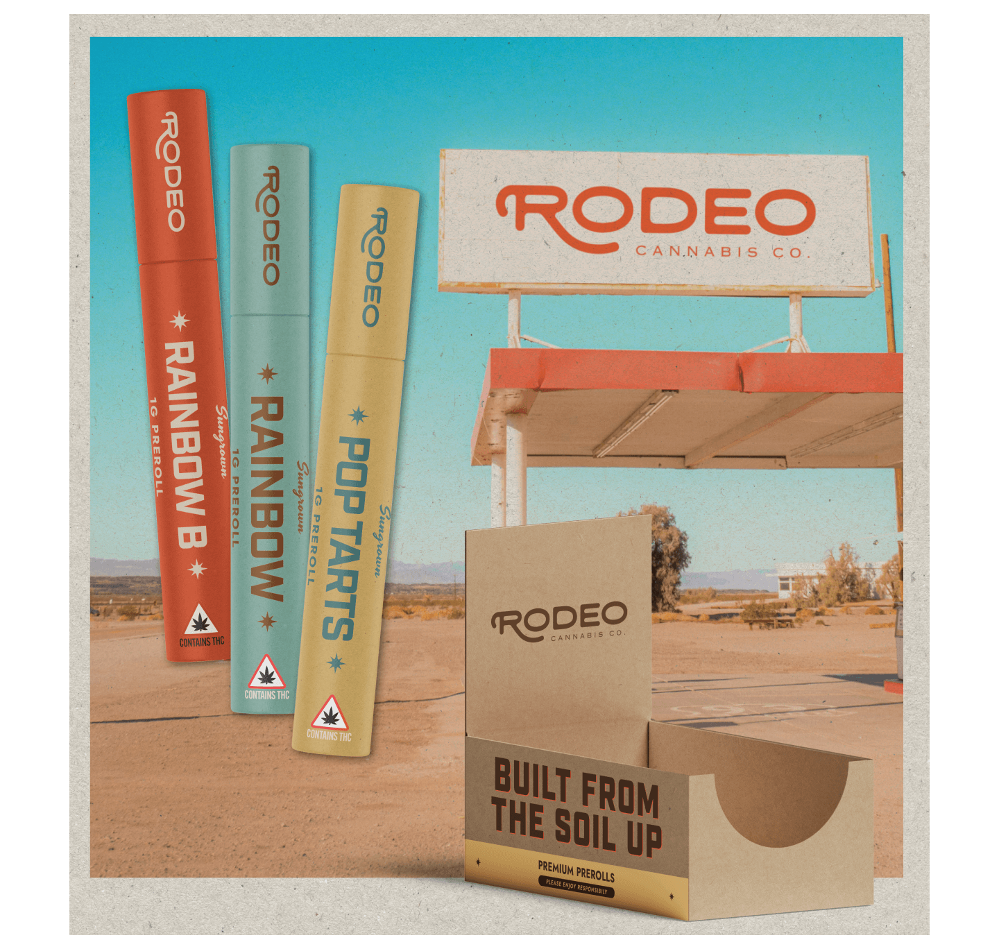
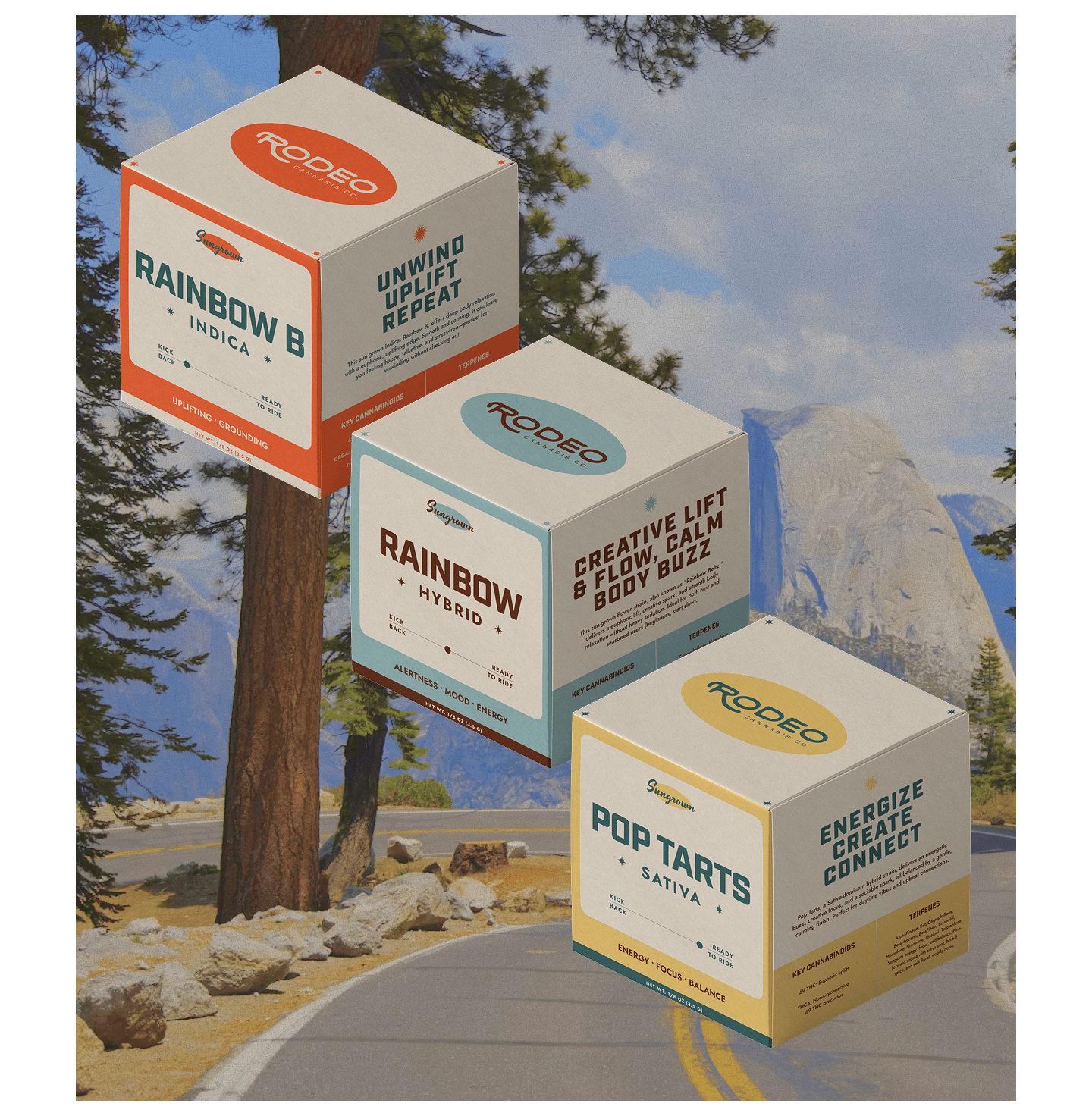
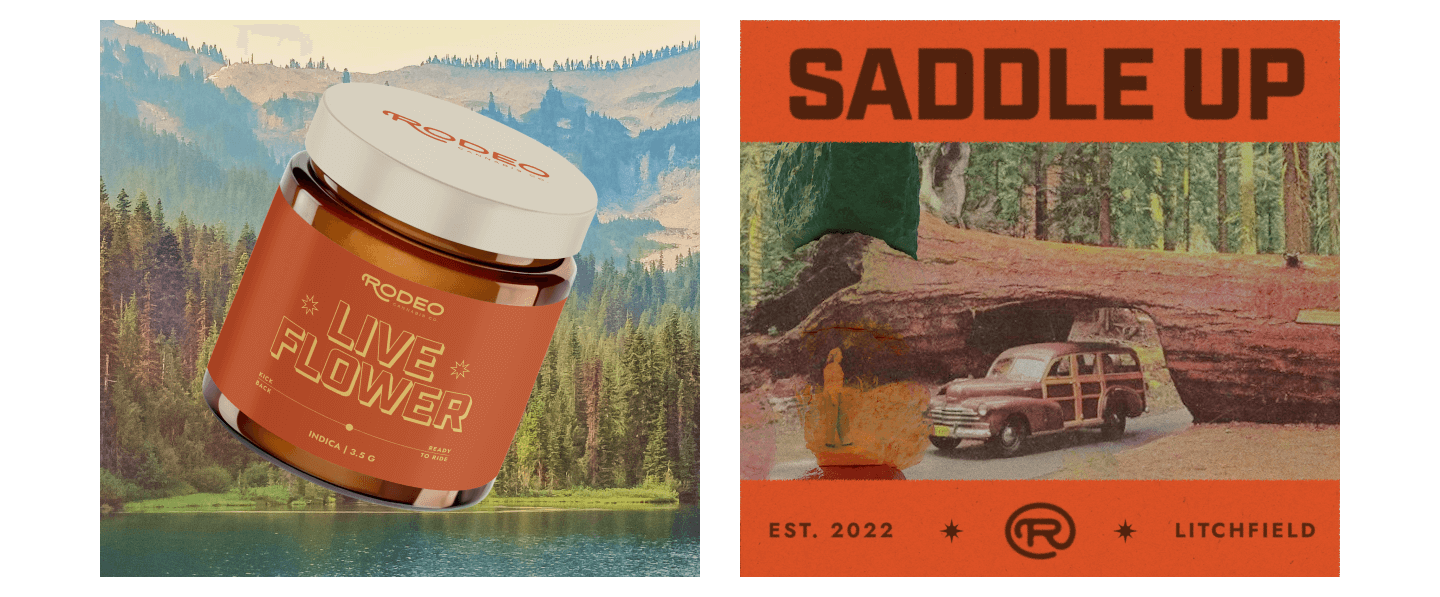
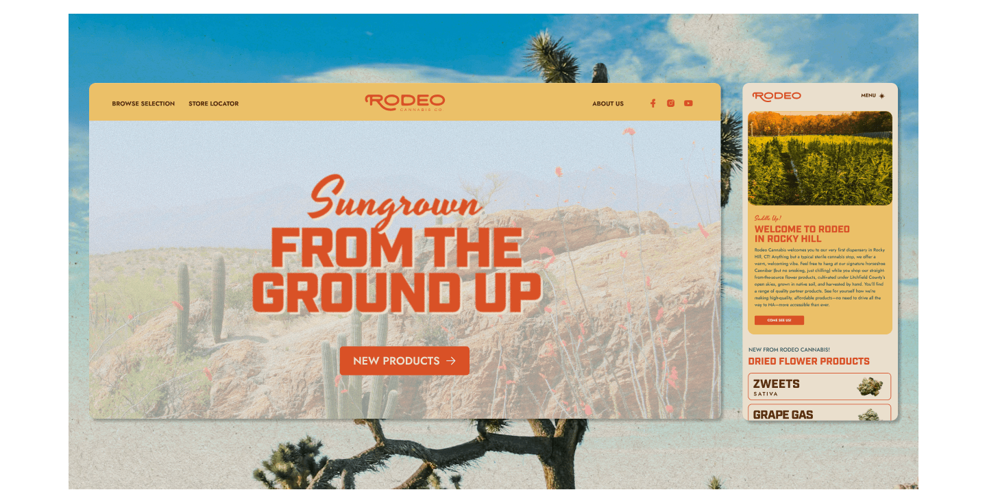
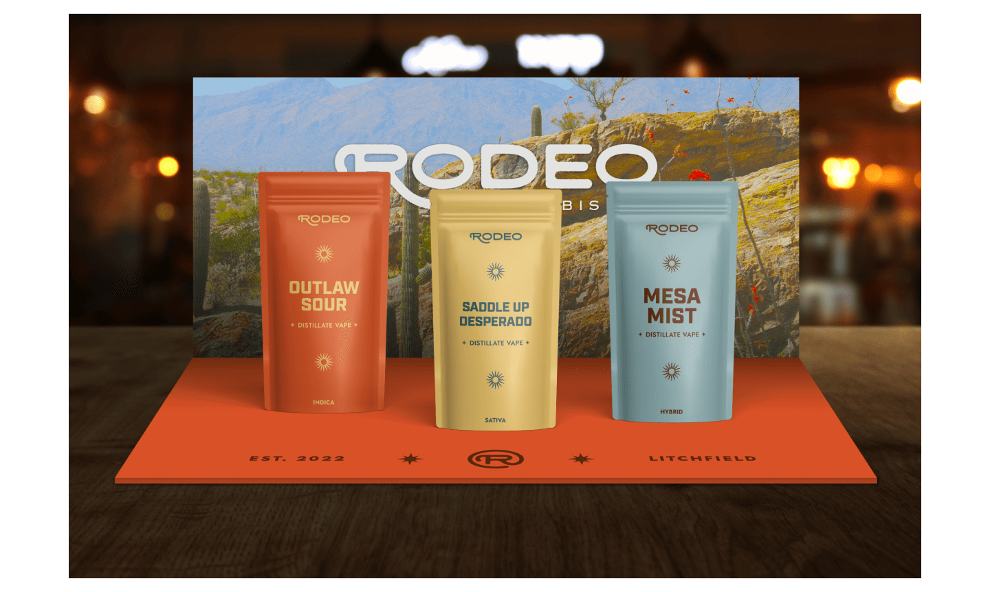
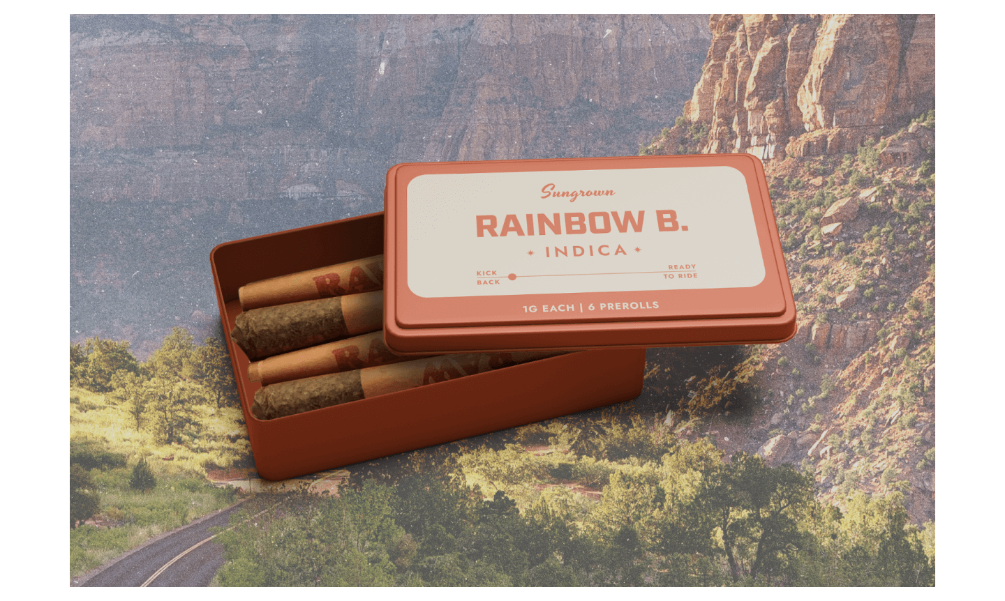
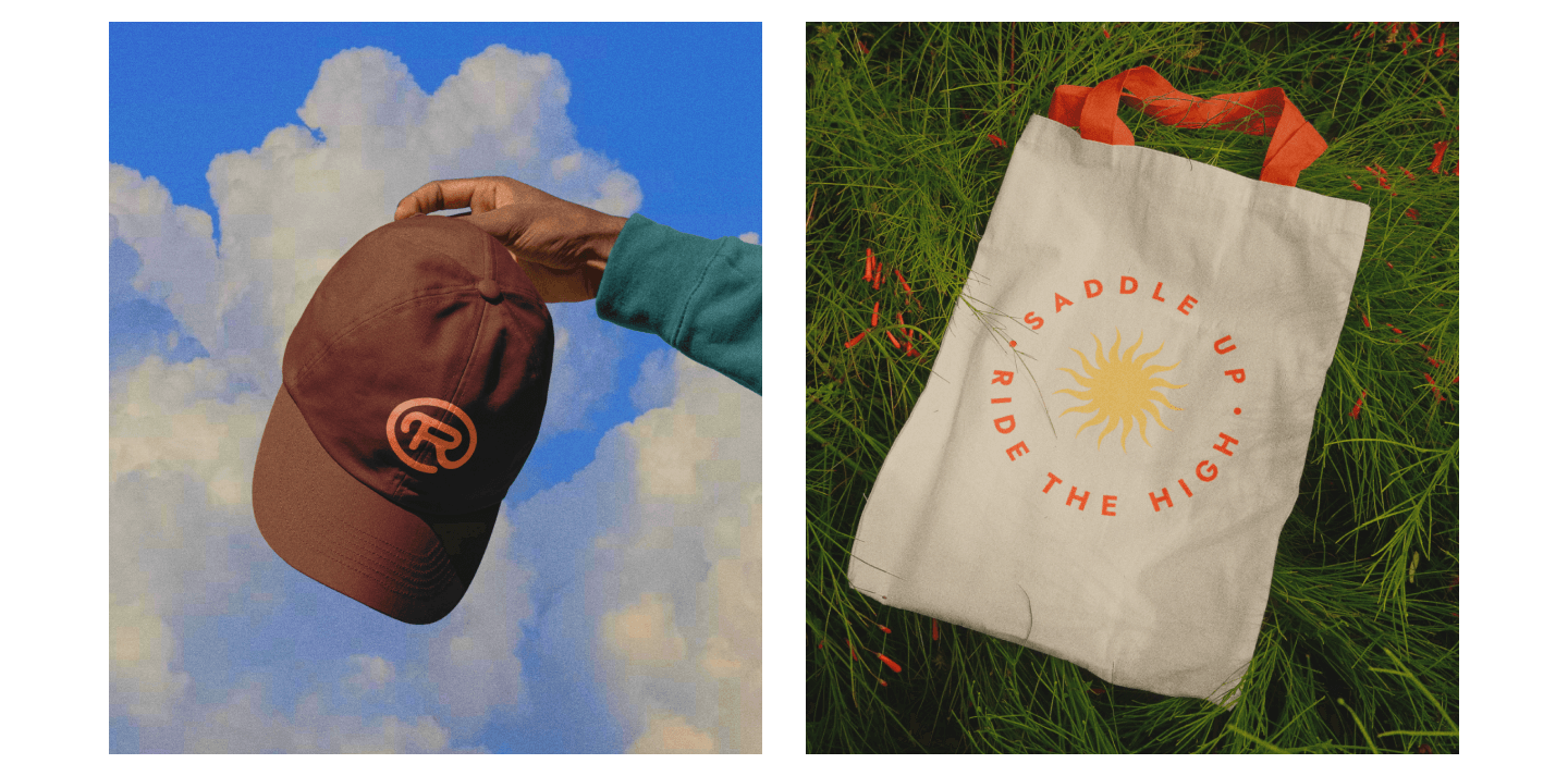
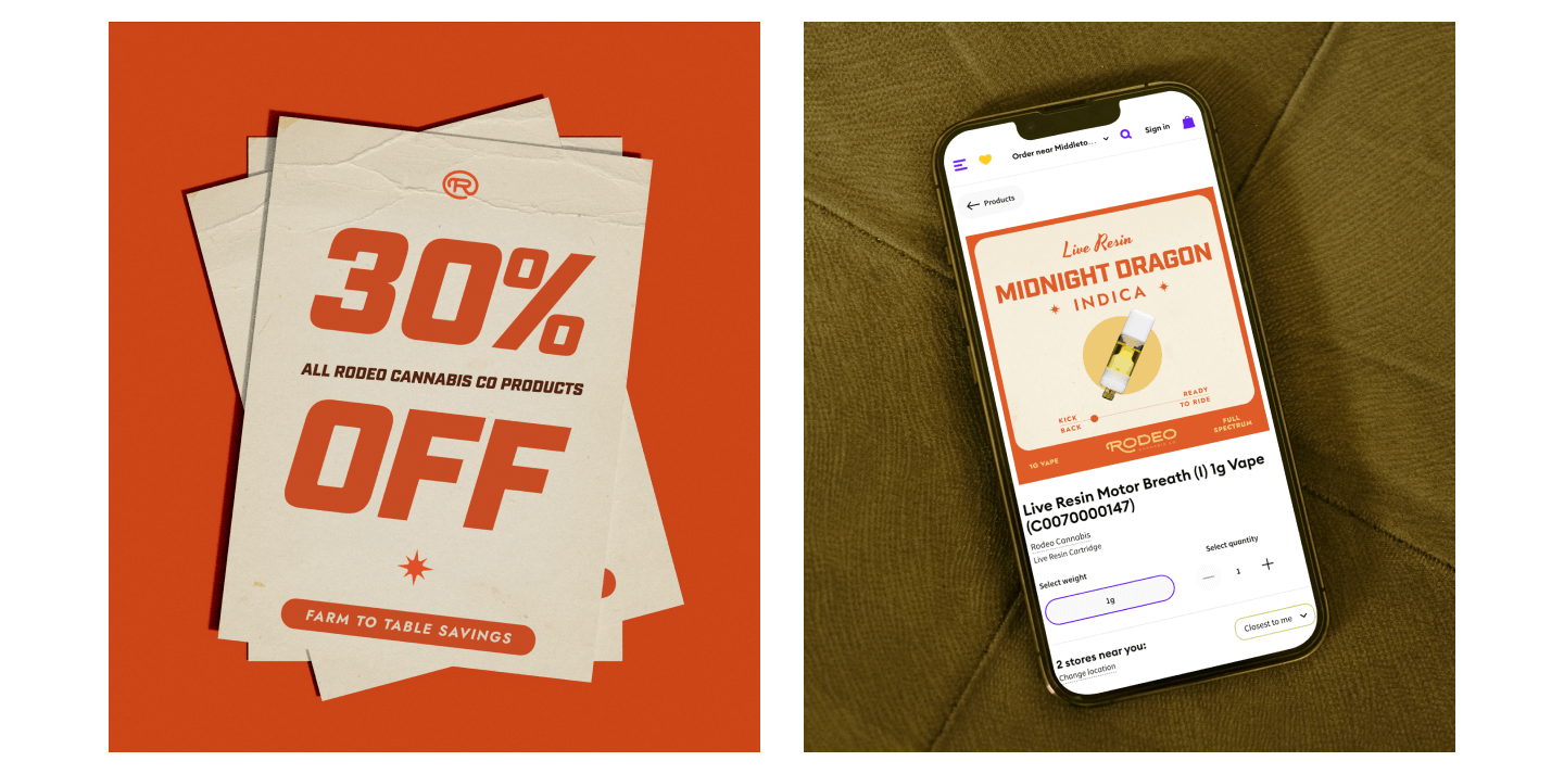
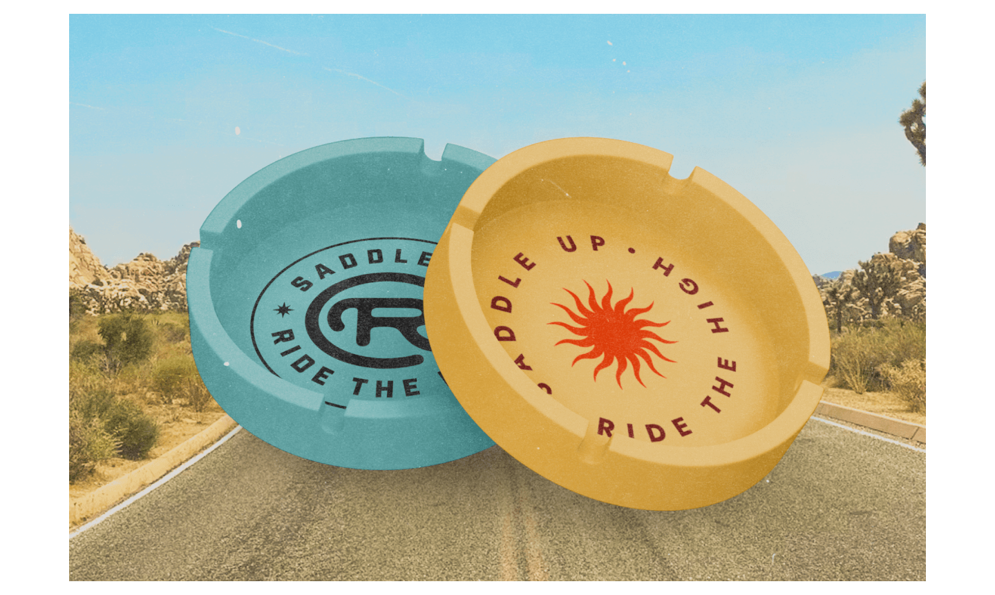
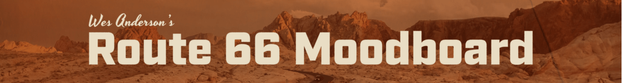
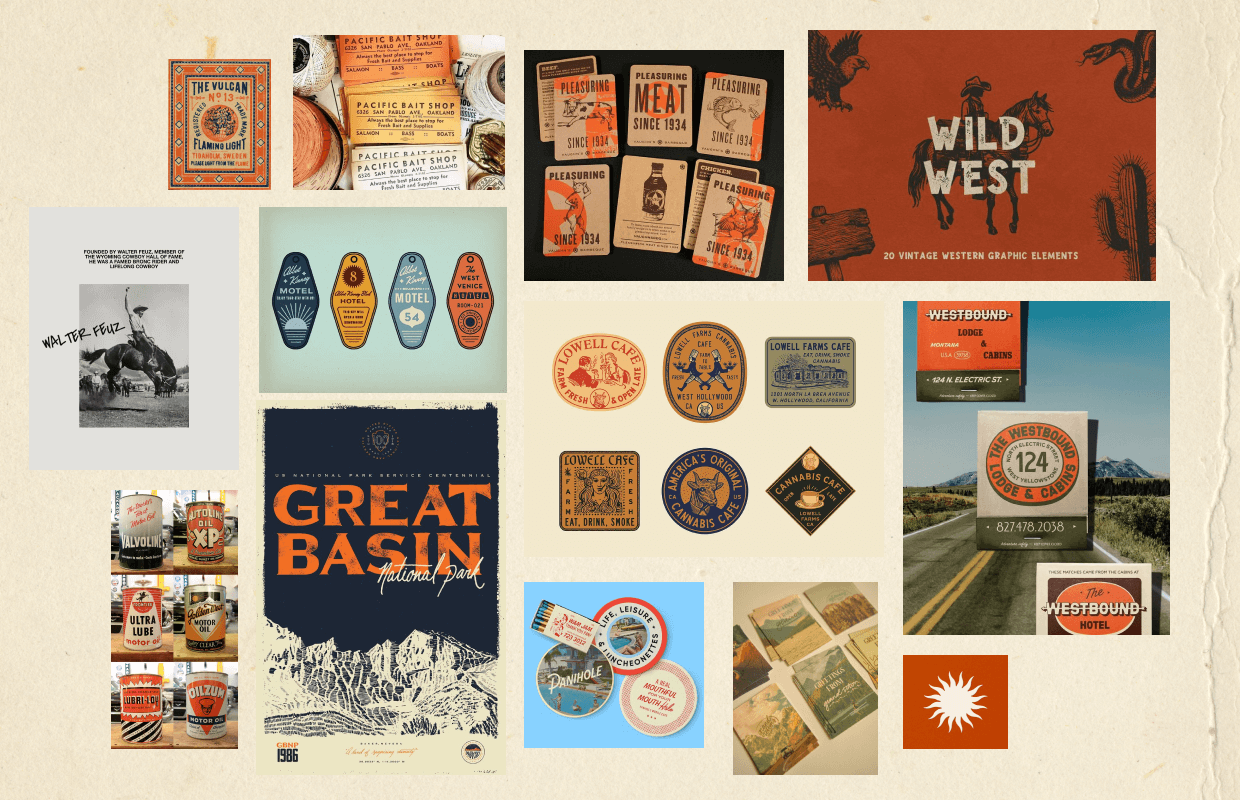
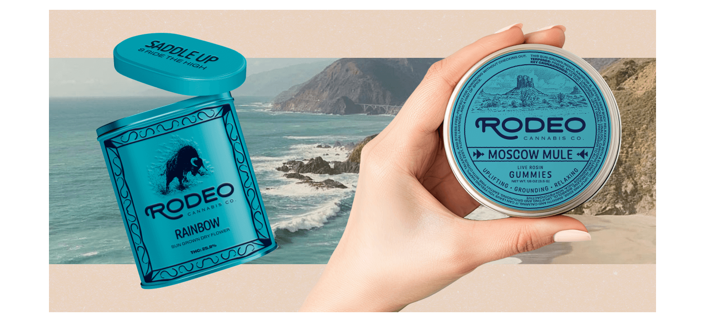
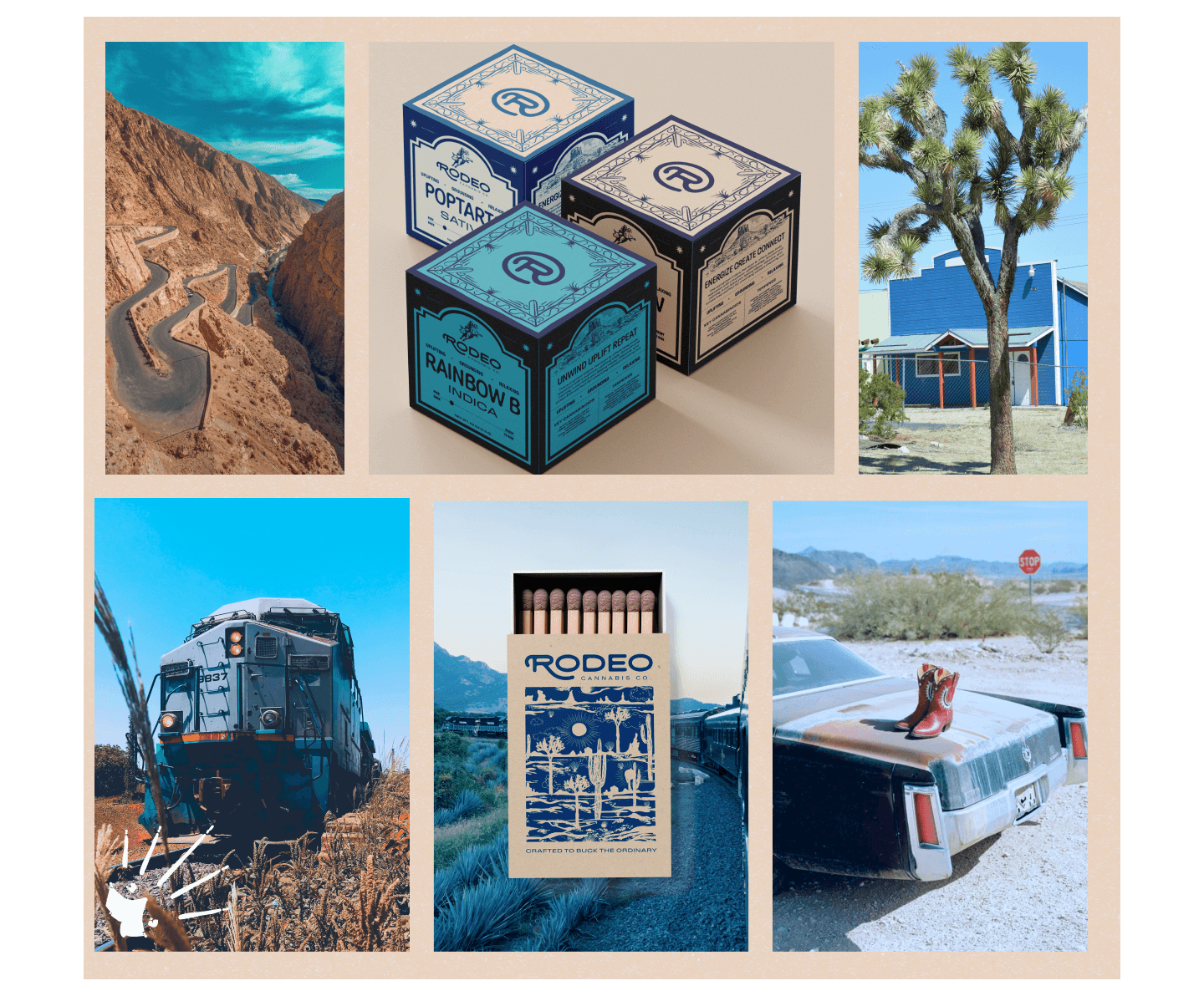
Wes Anderson’s Route 66 Road Trip, the direction ultimately selected, is warm, cinematic, and intentionally nostalgic, drawing from classic roadside Americana through a carefully curated, storybook lens. Retro typography, structured layouts, and harmonious color palettes create a sense of order and charm, while travel badges and maps evoking the romance of the open road. It’s pioneer-meets-roadside aesthetic that feels optimistic and timeless, inviting customers into a journey that’s as considered as it is adventurous.
That same sense of intention and adventure guided the entire rollout, informing packaging, collateral, the website, ads, merch, and more, and turning every touchpoint into another stop along the journey.